Graphing Your Data
A graph is a pictorial presentation of numeric data. A graph is also an analysis tool that you use to visually highlight relationships or trends. Types of graphs include area, bar, line, pie, scatter graphs, and others. Values from worksheets, or data points, are displayed as bars, lines, pie slices, etc.
Discoverer provides the Graph Wizard to help you create and edit graphs. A series of dialogs takes you through the processes of choosing the data that you want to graph, what kind of graph you want, and how the graph should look.
About Worksheets and Graphs
Each Discoverer worksheet can have one graph. If you already have a graph in a worksheet and want create a completely new graph, you can either:
- First delete the existing graph, then create a new graph.
- Duplicate the worksheet to create a new worksheet, then create a graph for the new worksheet, (using the options Sheet ¦ Duplicate as Table and Sheet ¦ Duplicate as Crosstab).
For more information about deleting graphs, refer to Deleting Your Graph.
If you change the data in a worksheet, the graph automatically updates to show the new data. Graphs are also automatically saved with the worksheet. You do not have to save a graph, although you can edit it or delete it if you wish.
Graphing terminology
The terminology below appears in the Graph Wizard and in the documentation.
 Group
Group
In a graph, a group is a subset of the displayed data, generally Markers that are connected to each other or are aligned with each other. For example, in a stacked bar graph, each stack of bars is a group.
|
 Marker
A Marker is a graphical object that represents data values. Data Markers can be bars (in bar graphs), lines (in line graphs), slices (in pie graphs), areas (in area graphs), or data points (in scatter graphs). Markers of the same shape and color are referred to as a data series.
|
 Label
Label
Labels are text attached to graph Markers. For example, if your graph shows four bars that represent sales for each quarter, the labels at the top of each bar could show the total sales amount in each quarter. Both the X-axis and the Y-axis can have labels. Even the individual slices of a pie chart can have labels.
|
 Legend
A legend explains the Markers in a graph. A legend displays the data Markers for the data that the Markers represent. For example, if your graph shows three bars that represents the three months in a quarter, the legend explains which colored bar corresponds to which month.
|
Choosing the best graph type for your data
To present your worksheet data visually in Discoverer, you can choose from 12 graph types. For example, Bar Graph, Line Graph, and Pie Graph. Each graph type has one or more variations, or sub-types. For example, the Area Graph has three sub-types: Area, Percent Area, and Stacked Area.
Most graph sub-types have a three-dimensional effect that you can switch on and off as required (using the 3D-Effect check box).
Note that the 3D-Effect should not be confused with three-dimensional graphs, such as 3D-Cube and Surface, which are used to represent multi-dimensional data.
Some graphs also have a dual-Y sub-types, which have two Y-axes. Dual-Y graphs are useful for showing the following types of data:
- data of different measures (such as Sales on the Y1-axis and Profit on the Y2-axis)
- data of different scales (such as Region Sales on the Y1-axis and Percent of Total Sales on the Y2-axis).
(See also notes in Creating Dual-Y Charts.)
Graph Types Described
 Bar graph
A graph that compares values using vertical bars. Each value is represented by a single bar. A bar graph shows variation over a period of time or illustrates comparisons between values. The stacked sub-type shows each value's relationship to a whole.
|
 Horizontal Bar graph
Identical to a bar graph except that the bars lie horizontally, rather than standing vertically. Horizontal bars place more emphasis on comparisons and less emphasis on time. The stacked sub-type shows each value's relationship to a whole.
|
 Line graph
A graph that shows trends or changes in data at even intervals. Data is represented as a line that connects a series of data points. Although similar to an area graph, a line graph emphasizes trends.
|
 Point graph
Similar to a line graph in that data is represented by points, however the data points are not connected by a line.
|
 Area graph
A type of graph in which data is represented as a filled-in area.
|
 Pie graph
A graph in which data is represented as sections of a circle, making the circle look like a sliced pie. A pie graph shows the proportion of parts to a whole. It is useful for emphasizing a significant element, such as the highest value. Note that a pie graph always displays only one data series, that is, one row or one column of data at a time.
|
 Polar graph
A circular scatter graph. The circular shape allows you to present cyclical data and is especially useful for showing directional data.
|
 Scatter graph
A graph with points scattered over the plot area. Each point is a value whose coordinates are specified by two numeric measures. A scatter graph shows relationships between two measures, for example Sales and Cost. A scatter graph is useful for comparing two measures that both have many values. All points are the same size, regardless of their value.
|
 Bubble graph
Bubble graphs add another measure to the points of a scatter graph because the size of the bubble is significant. Each bubble is a value whose coordinates are specified by three numeric measures. A bubble graph shows relationships between three measures, for example Quarter, Sales, and Profit. The third measure determines the size of the bubble. A bubble graph is useful for comparing three measures that have many values. (See also notes in Creating Bubble Graphs.)
|
 Stock graph
A graph in which each data Marker typically shows three values, such as the high, low, and closing stock price. Stock graphs are useful for comparing the prices of different stocks or the stock price of an individual stock over time. (See also notes in Creating Stock Charts.)
|
 3D graph
A true three-dimensional graph, where you can see an X edge, a Y edge, and a Z edge. 3D graphs have a floor, a wall, and a background. There are four 3D graph sub-types: 3D Bar, 3D Cube, 3D Area, and 3D Surface. These types of 3D graphs are useful for showing trends or to compare values. Note, this graph type is not the same as one created using the 3D Effect checkbox. The 3D Effect checkbox allows you to add depth to any graph type.
|
Notes on creating Graphs
To create meaningful graphs in Discoverer, you need to have the correct Worksheet configuration for the style of graph that you wish to use. This section contains advice on getting the best results when using graphs in Discoverer.
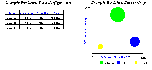
Creating Bubble Graphs
When you create Bubble Graphs, follow these guidelines:
- You need at least three Items.
- the X Item- the Bubbles's location on the X-axis.
- the Y Item- the Bubbles's location on the Y-axis.
- the Z Item - the size of the Bubbles, (which should be positive numbers).
For example, if the Marker Bubble is Sales, the X and Y axes could show Advertising costs and Store Size in square metres (M²). You could then see whether the largest stores with the most advertising generated the highest Sales revenue. Figure 3-1 below shows how the Worksheet data arranged 'Series by row' is represented on a Bubble Graph. The bubbles represent Sales. The larger the bubble, the larger the Sales revenue.
Figure 3-1 Example Data Configuration for a Bubble Graph
Creating Stock Charts
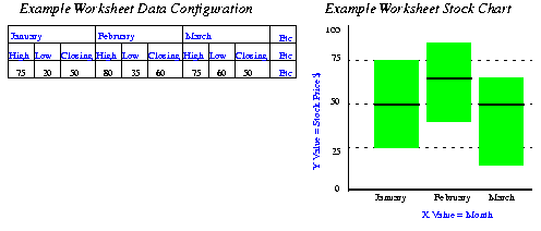
When you create High-Low-Close Stock Graphs, follow these guidelines:
- You need at least three Items in the following order:
- High price
- Low price
- Closing price
- Stock values for High, Low, and Closing prices must appear on the same row or column series as groups of three.
- To display data for more than one period, the data must be in multiples of three, such as three columns for period 1, three columns for period 2, and so on.
- High-low-close stock graphs usually have only one series of data. The series should be the name of the stock whose prices you show in the graph.
- If a high-low stock graph contains more that one series of data, and prices overlap, some stock Markers will obscure other stock Markers.
For example, Figure 3-2 shows a Worksheet configuration for charting a stock price over time, (January, February and March).The Worksheet data arranged 'Series by row'.
Figure 3-2 Example Data Configuration for a High-Low Stock Chart
Creating Dual-Y Charts
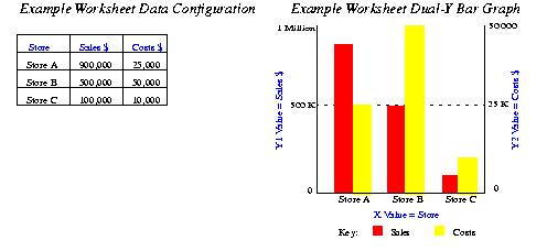
When you create graphs with Dual-Y series, follow these guidelines:
- The Dual-Y facility can be used with the following types of Graph:
- Dual-Y Graphs require at least two series of data.
- By default, the series are displayed in the following way:
- Series 1 is displayed on the Y1 axis.
- Series 2 is displayed on the Y2 axis.
- All subsequent series are displayed on the Y1 axis.
In Figure 3-3 below, the Y1 axis represents Sales on the scale 0 to 1 Million. The Y2 axis represents Costs on the scale 0 to 50,000. The Plot Area tab of the Graph Wizard can be used to change which Y-axis is used for each series.
Figure 3-3 Example Data Configuration for a Dual-Y Bar Graph
Creating a Graph
Discoverer provides the Graph Wizard to help you create a graph of your worksheet data. Each time you use the Graph Wizard, Discoverer saves your settings for the next graph you create. If at any time you want to use your previous settings for the remaining steps, simply click the Finish button.
To create a graph
- From the Graph menu, choose New Graph. The Graph Wizard appears.
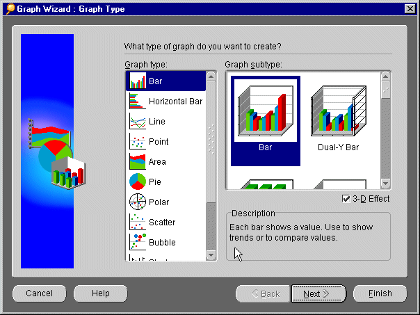
- Choose the type of graph that you want by clicking an icon in the Graph type box on the left side. The corresponding graph sub-types appear in the Graph sub-type box on the right side. Choose a graph sub-type (for example, Bar or Dual-Y bar).
The Description box at the bottom of the Graph Wizard describes the purpose of each graph type. If you are unsure what type of graph to use, see "Choosing the best graph type for your data". If active, click the 3D Effect checkbox to add depth to any graph type.
Click Next. The Titles, Totals, and Layout dialog appears:
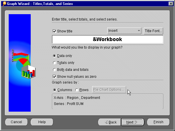
- If you want a title on your graph, put a checkmark in the Show Title checkbox. Type the title you want in the text box. If you want to add the date, time, or other worksheet information to the title, click the Insert drop-down menu and select the element you want to insert. Click the Font button to choose the font size and color for your title, (refer to "Choosing Font Options" for more information about setting fonts).
- Answer the question, "What would you like to display in your graph?" by clicking one of the radio buttons:
- Data Only to graph all the data point values of your worksheet but exclude any totals.
- Totals Only to graph only the data in the Totals columns or rows of your worksheet.
- Both Data and Totals to graph everything in your worksheet, both the individual data points and their totals.
Put a checkmark in the Show null values as zero checkbox if you want a Marker with a zero value for all null values. Otherwise, null values are not represented in the graph.
- Click a radio button to choose whether you want to graph a column or a row of data. Note that a Pie chart shows values as parts of a whole, so you can graph only one column or row at a time. If you are not creating a Pie chart, skip to step 7.
- Click the Pie Chart Options button for additional controls. The Pie Chart Options dialog appears.
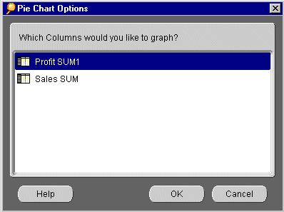
- The Pie Chart Options dialog lists the columns or rows that you currently have in your worksheet. Click the one that you want to graph, and then click OK to return to the Titles, Totals, and Layout dialog.
- Click Next. If you are creating a Pie chart, skip to step 17. If you are not creating a Pie Chart, the X-Axis dialog appears.
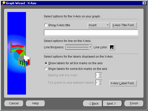
- Like the graph itself, the X-axis can also have its own title. If you want a title on the X-axis, click the Show X-Axis Title checkbox. Type the title you want in the text box. If you want to add a data item name to the title, click the Insert drop-down menu and select the item that you want to insert. Click the Axis Title Font button to choose the font size and color for your X-axis title, (refer to "Choosing Font Options" for more information about setting fonts).
- If you want a thicker line to indicate the X-axis, select the line thickness that you want from the Line thickness drop-down menu. Choose a color for the line from the Color palette.
- If you also want a label for the tick marks on the X-axis, click a radio button and select how often you want labels to appear. Click the Axis Label Font button to choose a font size and color for labels, (refer to "Choosing Font Options" for more information about setting fonts).
- Click the Next button. The Y-Axis dialog appears.
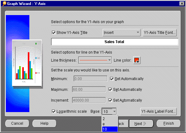
- Like the X-axis, the Y1-axis can also have its own title. If you want a title on the Y1-axis, click the Show Y1-Axis Title checkbox. Type the title you want in the text box. If you want to add the name of the data item to the title, click the Insert drop-down menu and select the item that you want to insert. Click the Axis Title Font button to choose the font size and color for your Y1-axis title, (refer to "Choosing Font Options" for more information about setting fonts).
- If you want a thicker line to indicate the Y1-axis, select the line thickness that you want from the Line thickness drop-down menu. Choose a color for the line from the Color palette.
- Discoverer will automatically set the scale for your Y1-axis data by measuring the lowest and highest values. However, if you want to choose your own scale, uncheck the Set Automatically checkboxes, and then type the scales that you want for your data, for example, Revenues in Thousands from 0 to 60 in increments of 10. Or check the Logarithmic scale checkbox, and then choose a Log base (example, log 10) from the drop-down menu.
- Click the Axis Label Font button to choose a font size and color for the axis labels, (refer to "Choosing Font Options" for more information about setting fonts).
- Click the Next button. If you are creating a Dual-Y graph, the Y2-Axis dialog appears. Repeat steps 12 through 16 for the second Y-axis. Otherwise, continue to step 17.
- The Plot Area dialog appears. Do any of the following:
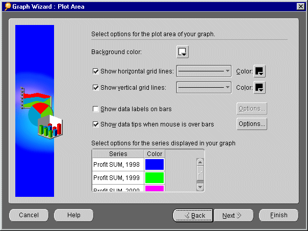
- Click the color palette icon to choose a background color.
- Click the Horizontal and Vertical gridlines checkboxes, and then choose a line width and color for each.
- Insert a checkmark to add labels for data Markers. To decide whether the label should appear on top of a Marker or inside a Marker (for example, on top of a bar or inside a bar), click the Options button next to this selection.
- Insert a checkmark to add text that pops-up whenever you hover the mouse over a data Marker. Click the Options button next to this selection to decide what text to display in the pop-up.
- Select options, such as color, for series (rows or columns from your worksheet) that are displayed in your graph. For a dual-Y graph, select which axis to use for each series.
- Click the Next button. The Legend dialog appears.
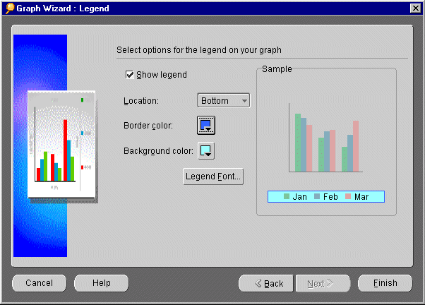
- If you want to show a Legend on your graph, click the Show legend checkbox. Choose where you want to position the legend on the graph from the Location drop-down menu. Select a border color and background color from their color palettes. Click the Legend Font button to choose a font size and color for text that appears in your legend.
NOTE: Once you have created your graph, you can reposition the legend by dragging it with the cursor.
- To change any of your choices, click the Back button until you return to the dialog that you want. When you are ready to create the graph, click the Finish button. After a short delay, the graph appears. To position the graph, see Positioning Your Graph with Your Worksheet.
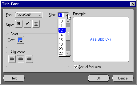
Choosing Font Options
The Font Options dialog is used to set the font style for the various components of your graph. You can call this dialog from the following Discoverer dialog boxes, (see example screen shot of the Title Font dialog below).
Table 3-1 How to call the Font Dialog from the Graph Wizard
To set your font options
- Select a font style from the Font drop-down menu. Select a font size from the Size drop down menu. Click any combination of Style buttons for bold, italic, and underlined styles. Select a color for your text from the Text color palette.
- Also, click one of the Alignment buttons to align your text to the left, center, or right. The Example area on the right shows you how your text will appear in your graph. (Click the Actual font size checkbox to see how large the text will look on your graph.) Click OK to return to the previous dialog.
Positioning Your Graph with Your Worksheet
Positioning the graph with your worksheet affects how they appear together on screen. Positioning the graph does not affect the order that the worksheet and graph print.
To position your graph
- From the Graph menu, choose Display Graph.
- From the Display Graph sub-menu, click one of the following:
- Separate Window to display the graph in a window that floats above the worksheet window. You can move the graph window to any location on your screen by dragging it with the mouse.
- Right of Data to display the graph in a window that is connected to the right side of the worksheet window.
- Left of Data to display the graph in a window that is connected to the left side of the worksheet window.
- Above Data to display the graph in a window that is connected to the top of the worksheet window.
- Below Data to display the graph in a window that is connected to the bottom of the worksheet window.
- Hide/Unhide Graph to display the graph or hide the graph. The Hide option does not delete the graph.
- Click Fit to window if your graph is too large to fit completely inside its window panes without scroll bars. The graph resizes so that it is completely visible inside its window.
Using the Graph Toolbar
When working with graphs, you can use the Graph Toolbar to quickly make cosmetic changes to the look of your graphs without using the Graph Wizard. For example, you can change fonts, colors, and text alignment.
Saving Your Graph
When you save a worksheet, Discoverer saves the graph automatically for you as part of the worksheet.
If the data in your worksheet changes, the graph updates automatically. Any changes you make to the graph are also saved automatically when you save the worksheet.
Deleting Your Graph
To delete a graph
- From the Graph menu, choose Delete Graph. A warning message appears.
- Click Yes to delete the graph.