Release 4.1
Contents |
Index |
| Discoverer 4i Plus Online Help Release 4.1 |
|
Pivoting organizes your data by moving items from the main body of a table worksheet to the page axis. On a crosstab worksheet you have even more control over the elements you can pivot. For example, you can move data items from the main body of the crosstab worksheet to the page axis, side axis or top axis.
Click to learn how
To pivot an item on a table:
See also:
Sorting Data
Drilling Into and Out of the Data
Duplicating Tables and Crosstabs
Adding Calculations to Worksheets
Totaling Numeric Data
Calculating Percentages
The layout shows the items on the table and their current positions on the table.
The following example shows how to pivot the Region column to the Page Axis.
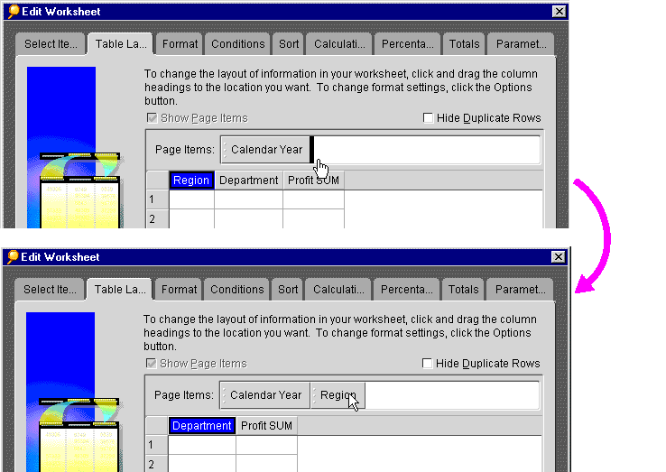
The Region column moves to the Page Axis.
The Region column moves to the Page Axis on the Worksheet.
The following example shows what the worksheet looks like before and after pivoting the Region item to the page axis.
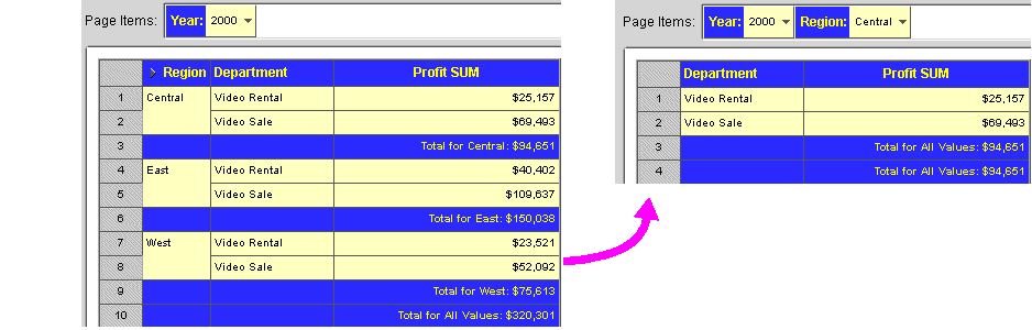
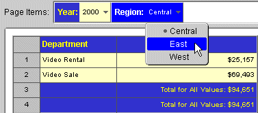
As you can see, putting the Region on the Page axis means that only one Region at a time appears on each page of the worksheet. To see the data from other Regions, select a new Region from the Region drop-down list, as shown in the following figure.
Because the data relationships on a crosstab depend on the intersection of the axis items, pivoting data from one axis to another creates a new set of data relationships. In addition, the new arrangement can add levels of data to an axis. For example, if the data on the side axis is for Region, pivoting the Year data item to the side axis add another level of data to that axis.
Use the same drag-and-drop process to move a data item from one axis to another on a crosstab, just as you do to move the columns on a table as shown above.
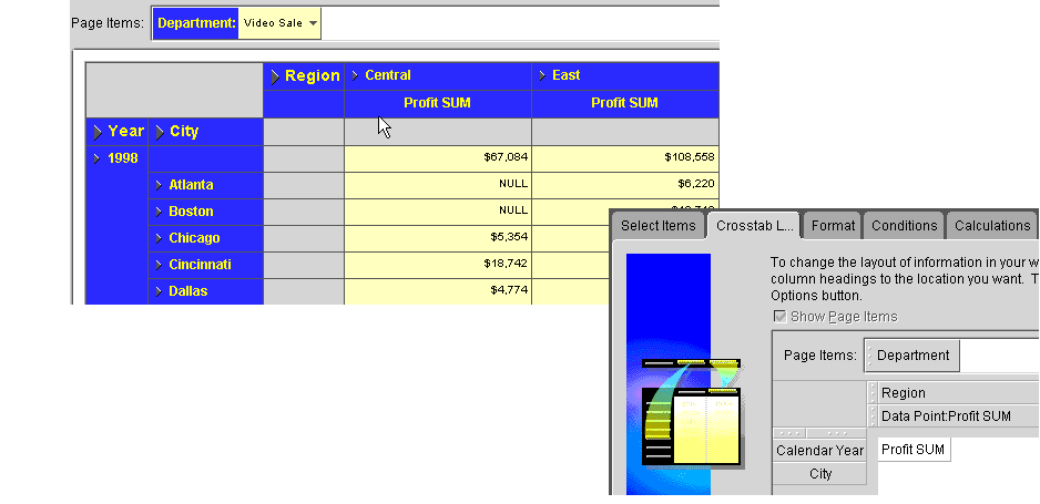
The example below shows a Crosstab Worksheet and its Crosstab Layout arrangement.
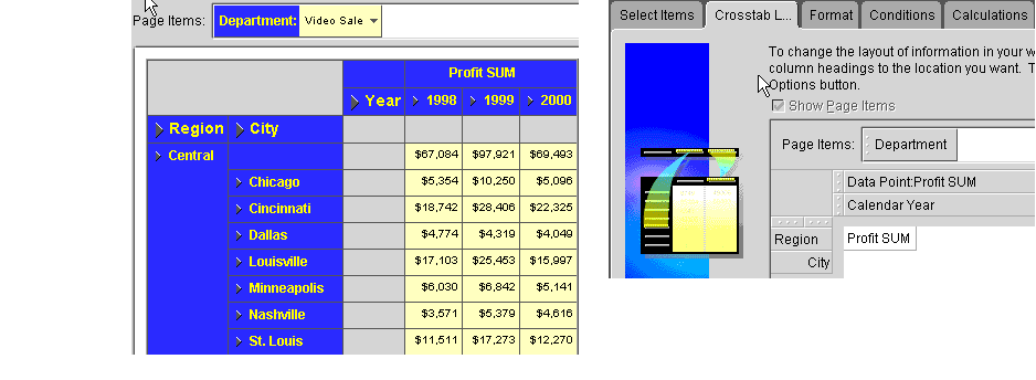
In the example below, the Year Item has been pivoted to the left-hand axis, and the Region Item has been pivoted to the top axis. You can then make more direct comparisons between Regions as the Regions appear side by side.
As you can see, pivoting items on a crosstab provides you a powerful means to analyze the data.
|
|
 Copyright © 2000 Oracle Corporation. All Rights Reserved. |
|